Data Visualization
Turning raw data into interactive charts, graphs, and dashboards for business leaders to take action.
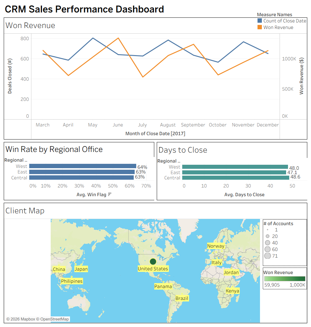
The Story: CRM Sales Performance Dashboard
A Tableau dashboard I built from CRM pipeline data and structured around four questions sales and operations leaders actually ask: is a region underperforming, is one slower to close, is the business growing, and where is the client base concentrated. The breakdown covers the checks — product mix, account difficulty, deal volume — approach method I run before calling any region behind.
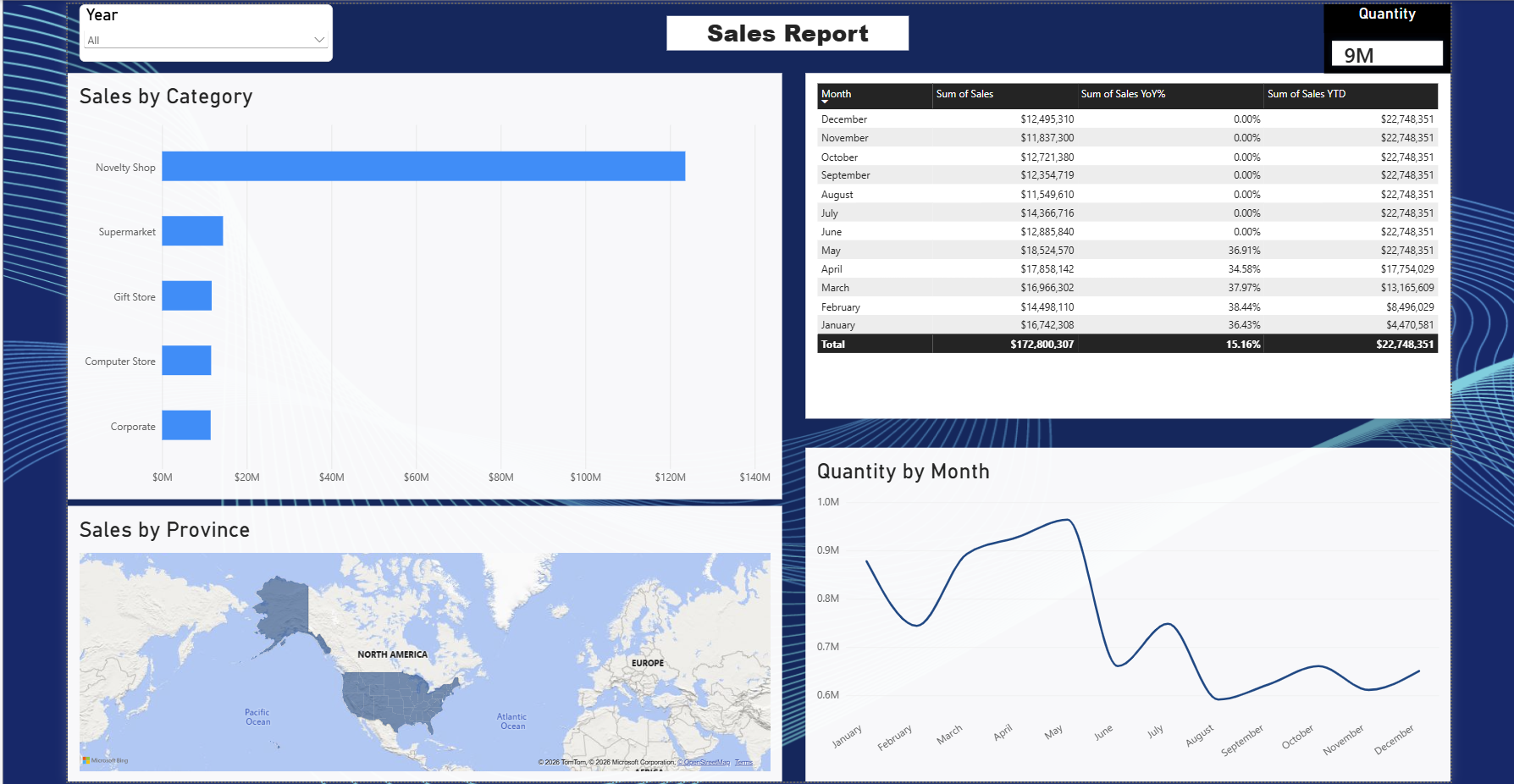
The Story: Power BI Sales Dashboard
$172M in total sales looked healthy, until the number was broken out by customer category instead of left as one flat total. I modeled invoice line items against a customer list in Power BI to see which channels were actually driving that revenue. The model surfaced what the top-line total hid: one channel, Novelty Shop, was carrying about 70% of the $172M, while the other four sat close together and far behind it. The video walks through every build step, from importing and relating the data to publishing the finished report.